
Monday, October 27, 2008
Monday, October 20, 2008
artist statement, redux.
In Printing 3 we're writing our artist statements, as I posted earlier in the semester. So far, I've been frustrated with the process, mostly out of an understanding that what I envision for my work now is most likely not what I will envision for my art in ten, or even five, years. I feel the need to print Orthodox saints because of they are under represented in art. Not only that, throughout the past two years I have developed a very real relationship with the Saints and consider it an honor to print materials that deal with their lives... anyways, without further rambling, artist statement, take 20:
Orthodox Christianity is the foundation of my life, and I could not imagine a life without the Saints, without an ancient Faith, full of daily rituals and discipline. I literally pay homage to the subjects I print, most significantly when printing Saints. Having deep respect for the Earth and her creations, along with a desire to create all facets of my work, I begin with the source. At a very basic level I work to prepare fibers for cooking, cleaning, beating, to eventually become the very paper I print upon. Paper is no longer a tool in the process of book making, but an integral piece of the art. My life’s work is split between art and research in Women’s Studies and Rhetorical Studies. Both my research interests and book arts creations are incredibly personal in nature. I approach the subjects that are most important to me indirectly as to interrogate personal doubt and societal inequities in connected, but not overly predictable ways.
Recent and current projects:
(Spring, 2008): “Patrons: Reflections On Our Namesakes”
This chapbook was created in collaboration with other Orthodox Christians. Four writers (including myself) wrote a brief statement, thought, or prayer, regarding their relationship to their patron saint. Handmade paper was used for half the edition’s covers, and all of the center French door fold outs. The images were and text were created from the authors’ handwriting and ink drawn images of the saints. The ultimate purpose of this project was to increase understanding and awareness of Orthodox saints.
(Fall, 2008): “The Church and the Hospital”
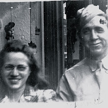
This book is in the process of being printed in collaboration with the band Umbrella Tree’s lyrics from the album “The Church and the Hospital” in Nashville, TN. In this project I am using an old-world aesthetic juxtaposed with a modernist twist. The book is bound flatback style using a ¼ cloth spine and handmade paper that has been marbled and painted over thinly using paste and acrylics. Text paper is Frankfurt cream, and the two gatefolds are handmade paper. The type has been set digitally using Polipholis and Polipholis Small Caps typefaces. Images throughout the book are from personal family archives from my father’s side. Again, the images relate to one or two lyrics in a connected but not overly predictable fashion. Sketches in the form of scratch negatives were made into photopolymer plates and printed over several of the photographs to further question the book’s traditional influences.
Orthodox Christianity is the foundation of my life, and I could not imagine a life without the Saints, without an ancient Faith, full of daily rituals and discipline. I literally pay homage to the subjects I print, most significantly when printing Saints. Having deep respect for the Earth and her creations, along with a desire to create all facets of my work, I begin with the source. At a very basic level I work to prepare fibers for cooking, cleaning, beating, to eventually become the very paper I print upon. Paper is no longer a tool in the process of book making, but an integral piece of the art. My life’s work is split between art and research in Women’s Studies and Rhetorical Studies. Both my research interests and book arts creations are incredibly personal in nature. I approach the subjects that are most important to me indirectly as to interrogate personal doubt and societal inequities in connected, but not overly predictable ways.
Recent and current projects:
(Spring, 2008): “Patrons: Reflections On Our Namesakes”
This chapbook was created in collaboration with other Orthodox Christians. Four writers (including myself) wrote a brief statement, thought, or prayer, regarding their relationship to their patron saint. Handmade paper was used for half the edition’s covers, and all of the center French door fold outs. The images were and text were created from the authors’ handwriting and ink drawn images of the saints. The ultimate purpose of this project was to increase understanding and awareness of Orthodox saints.
(Fall, 2008): “The Church and the Hospital”
This book is in the process of being printed in collaboration with the band Umbrella Tree’s lyrics from the album “The Church and the Hospital” in Nashville, TN. In this project I am using an old-world aesthetic juxtaposed with a modernist twist. The book is bound flatback style using a ¼ cloth spine and handmade paper that has been marbled and painted over thinly using paste and acrylics. Text paper is Frankfurt cream, and the two gatefolds are handmade paper. The type has been set digitally using Polipholis and Polipholis Small Caps typefaces. Images throughout the book are from personal family archives from my father’s side. Again, the images relate to one or two lyrics in a connected but not overly predictable fashion. Sketches in the form of scratch negatives were made into photopolymer plates and printed over several of the photographs to further question the book’s traditional influences.
Wednesday, October 8, 2008
Vandercook.
Thanks to our friends at ebay, I am now the owner of a Vandercook 320 Proof press. It's in NY, and about to be moved to Frederick, MD for storage until we figure out where we're going to make a home. Probably somewhere cold, so I figured I should leave it in the North for now.


Saturday, October 4, 2008
flax sculpture.


flax is incredibly strong. I placed wires in between sheets of flax. as it dried, the wires were manipulated.
books I (re)bound


The book with red leather is _The Isle of Man_, which I rebound for Matt's mother for Christmas (her family is Manx). I thought that I would have a harder time paring leather than I did. I marbled the paper, also.
Portfolio photos.
In an attempt to be taken seriously, I spent the morning photographing whatever artwork/books I have at the house to use in portfolios/show entries, etc.
the first images are of pulp paintings. These were done over the summer, mostly under the instruction of andrea peterson at the paper and book intensive.
 love, protect, admire.
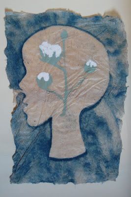
 cotton (on kozo)
 bird on a wire.
 birds on a wire.

 seraph series

 (this one is a large painting i did for m. it's hard to see because it's framed and the lighting is bad n our apt).
the first images are of pulp paintings. These were done over the summer, mostly under the instruction of andrea peterson at the paper and book intensive.
 love, protect, admire.
 cotton (on kozo)

 bird on a wire.
 birds on a wire.

 seraph series

 (this one is a large painting i did for m. it's hard to see because it's framed and the lighting is bad n our apt).


Friday, October 3, 2008
article.
my new s-i-l, christi sent me this article about pulp art. clearly, they feature chuck close: http://online.wsj.com/article/SB122299879388601049.html
Subscribe to:
Posts (Atom)
About Me
You should visit my friends at:
-
-
-
Read rx v571 manual Nook PDF5 years ago
-
-
holidays at home17 years ago
-
-
not yet tilted13 years ago